I found these maps while researching census data from 2000. I forget why I was there in the first place, but I found neat data for my town, a world population clock, and the graphs below.
This is the median age by county. There’s lots more older people in the brown sections. California is interesting – Young people in the south and old people in the north. And Florida is no surprise.
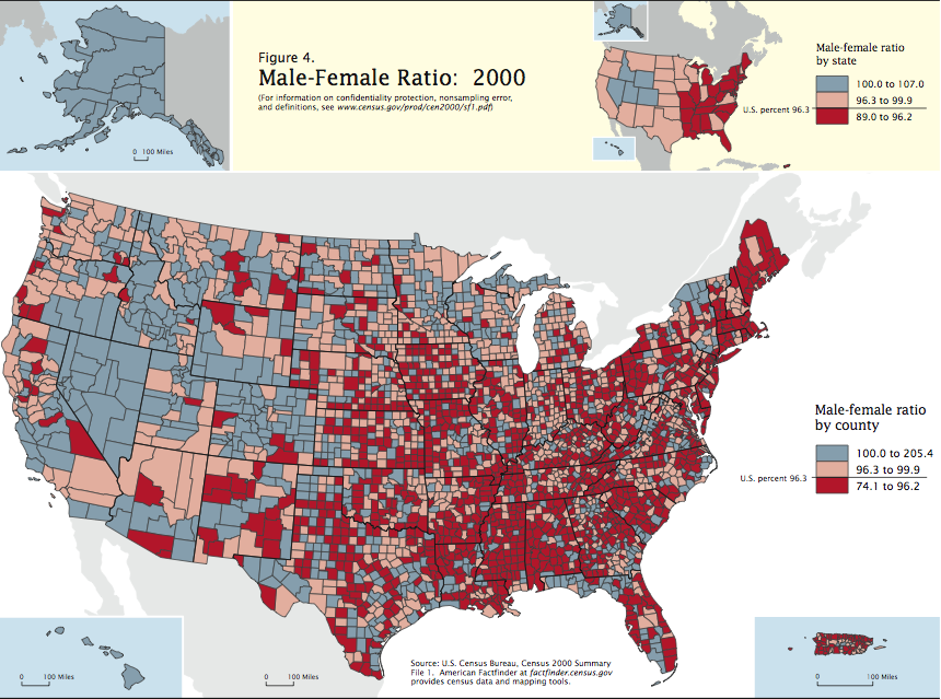
This shows the male/female ratio. Wow, look at the division here! It seems there’s many more ladies in the east as compared to the west! Perhaps this is a remnant of the pioneer days – men are more likely to rough it in the wilderness of the wild west? Alaska is predominantly male, which is no surprise. My state, MA, is a solid block of red. Nevada, Alaska, and Hawaii are all blue.
Do you have any theories on age and sex distribution?


Leave a Reply